XUYATA / FASHION EDITORIAL · 01 / THE ART OF THE PAUSE
The Art of the Pause.
A cup. A gesture. A moment of quiet. Blue Bottle Coffee is read here through the details that surround the drink: the measured movement of preparation, the restraint of a blue-and-white visual language, and the space to notice the everyday ritual. An independent XUYATA design interpretation—not an official statement from the brand.
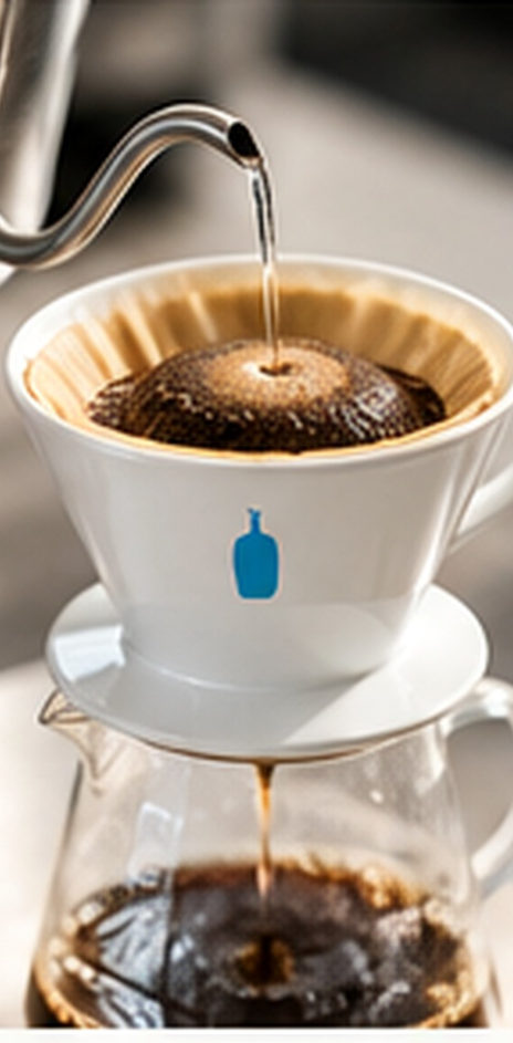

INDEPENDENT PROFILE · All photography and depicted branding are AI-generated conceptual illustrations, not official Blue Bottle Coffee assets or documentary images.
THE EDITORIAL INDEX / BLUE BOTTLE COFFEE
A language of less.
Specialty coffee, the familiar blue motif, café life, and at-home brewing: four points of entry into an intentionally restrained design reading.
Specialty coffee
The product category at the heart of this profile.
Cafés + home
Two settings through which coffee rituals can be experienced.
Blue + white
A recognizable, uncluttered visual shorthand.
Clarity + care
Our editorial lens: expression, preparation, ritual, and calm.
These four themes are editorial analysis—not official quotations of Blue Bottle brand values.
02 / FROM BEAN TO RITUAL
Before the first sip.
First, a crop. Then, a material. Finally, a moment. The journey from coffee cherry to roasted bean to brewing ritual is a way of reading the craft around the cup—not a verified account of Blue Bottle sourcing or production.
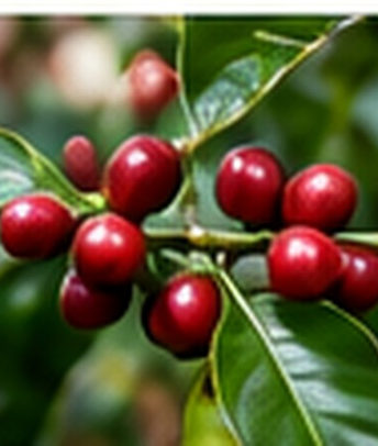
Origin
Coffee begins as a crop—a reminder that every cup has an agricultural starting point.

Material
Roasted beans turn the focus toward ingredients, handling, and craft.
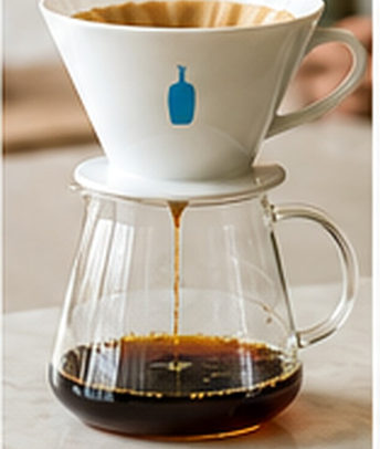
Moment
Preparation creates a point of attention before the cup is enjoyed.
The origin → material → moment sequence is XUYATA’s conceptual storytelling model, not a verified Blue Bottle sourcing or production flow.
EDITORIAL NOTE / MATERIAL AND CARE
Freshness as a signal.
The finest details of coffee preparation often speak quietly. Materials, attention, and the visible pace of making a cup suggest care without needing to promise it.
“In specialty-coffee storytelling, freshness, brewing precision, and attention to ingredients signal care.”XUYATA independent editorial study · Source PDF, page 3
This is a statement about specialty-coffee storytelling, not verification of individual Blue Bottle products, procedures, or locations. Specific founders, dates, and historical milestones were excluded from the source profile pending verification.
03 / LESS NOISE, MORE RECOGNITION
Less noise. More recognition.
What is left out matters. A clear bottle silhouette. A generous frame. A note of blue against neutral textures. This is XUYATA’s visual interpretation of the brand’s recognition cues—not a reproduction of official Blue Bottle artwork.
One clear symbol
An identifiable blue bottle motif gives the eye somewhere to land.
Space that speaks
Uncluttered framing allows coffee, tools, and textures to remain legible.
Warmth without clutter
Neutral surfaces soften the blue accent and return attention to the product.
Illustrated brand symbols are editorial approximations; do not use them as official logo files or trademark specifications.
THE COLOR EDIT / CONCEPT PALETTE
Four tones. One expression.
Blue cuts through the quiet. White opens the composition. Warm neutrals soften the space. Dark type holds it together. A study in contrast—not an official identity specification.
#118BC2
Signature blue (conceptual approximation).
#FFFFFF
Clear white space.
#FBFAF7
Soft warmth around the product.
#15343E
High-contrast, dark lettering.
Hex values are editorial approximations provided in the PDF, not confirmed official Blue Bottle brand specifications. Consult the current brand style guide for exact identity values.
THE OBJECT EDIT / CONCEPTUAL VISUALS
The shape of recognition.
Packaging, cup, brew: simple motifs move between object and ritual. Their repetition is an editorial design observation, not an official product catalogue.
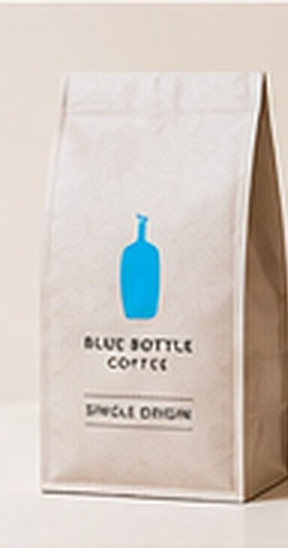
Every visual above was extracted from the supplied XUYATA PDF. These are AI-generated conceptual images, not official products, stores, or marketing materials.
04 / MADE FOR THE MOMENT
Every gesture counts.
A café serves the ready cup. At home, preparation becomes personal. Both invite a closer look at the tools, ingredients, and moments that frame the drink—without assuming one fixed brewing method or product offering.
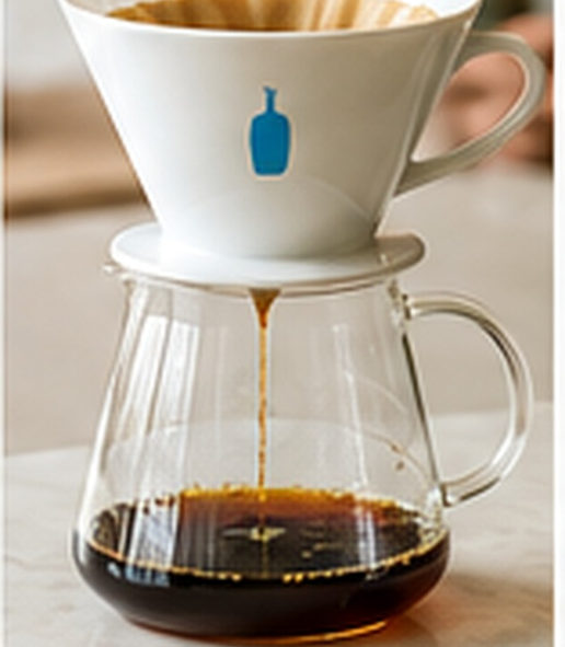
The café moment
A prepared drink can make technique and hospitality visible through the act of serving.
The at-home ritual
Coffee and brewing tools let a personal coffee routine continue beyond a café visit.
The source notes that exact at-home product assortments vary by market and time; no current inventory or availability is asserted here.
THE RITUAL / FOUR PARTS
From making to meaning.
Measure. Prepare. Pour. Enjoy. A deliberate sequence turns the act of making coffee into a story the eye can follow. This is a conceptual editorial model, not a Blue Bottle brewing standard.
Measure
Begin with intention rather than haste.
Prepare
Tools, ingredients, and careful movement take focus.
Pour
The action becomes visible: sound, aroma, and transformation.
Enjoy
The preparation gives way to a personal pause.
Measure → prepare → pour → enjoy is a XUYATA editorial diagram, not an official Blue Bottle brewing standard or employee procedure.
THE CRAFT PORTFOLIO / THREE IMAGES
Craft in close-up.
Hands and tools, the pour, the finish. What could be everyday actions becomes a closely observed visual study.


These images illustrate brewing actions conceptually; they do not document actual Blue Bottle equipment, recipes, employees, or procedures.
05 / A SPACE TO SLOW DOWN
The room around the cup.
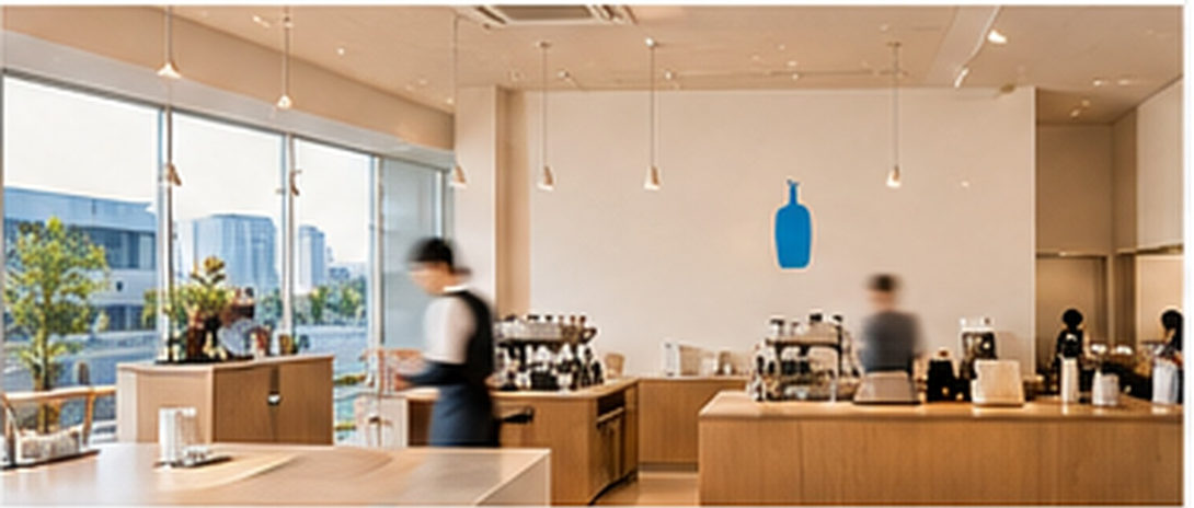
The setting can shape a small ritual. Light, material, sound, and the position of a counter influence what becomes noticeable. This illustrated café is an imagined environment, not a documented Blue Bottle store.
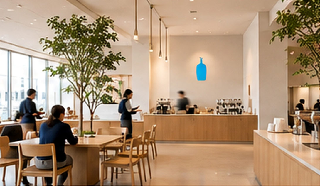
The first impression
An atmosphere can invite someone to settle into the experience.
Less friction
Readable choices and circulation can make ordering feel clear.
Craft in view
A visible brewing counter can bring preparation into the customer’s attention.
This café image and spatial reading are conceptual and do not establish the design or procedures at every Blue Bottle location.
THE CUSTOMER JOURNEY / CONCEPT MODEL
Four moments. One experience.
Arrive. Choose. Watch. Enjoy. Each stage offers a different point of attention. This sequence is XUYATA’s reading of a possible café encounter—not a service script.
Arrive
Atmosphere creates the first impression.
Choose
Clear choices can reduce friction.
Watch
Preparation makes craft legible.
Enjoy
The cup becomes the central experience.
Arrive → choose → watch → enjoy is the independent XUYATA conceptual journey model from the source PDF (page 6), not a verified service sequence.
06 / THE POWER OF SIMPLICITY
Distinctive by design.
Recognition can emerge from what remains: clarity in the visual frame, craft made visible, and a ritual that feels familiar. The interpretation is editorial, not a claim of market leadership or exclusive ownership.
Visual clarity
A simple arrangement allows the cup and bottle motif to be noticed without crowded messaging.
Visible craft
The act of making coffee can communicate attentiveness without a long promotional claim.
Repeatable ritual
Familiar preparation and serving cues can support continuity in the customer experience.
Readable storytelling
Focused imagery and simple information can make an editorial narrative easier to understand.
This is an independent design interpretation. It makes no claim of market ranking, exclusivity, or verified customer sentiment.
THE XUYATA CONCLUSION / A PULL QUOTE
The power of restraint.
At the heart of this independent profile is one idea: design feels strongest when it leaves room for the cup.
“The brand does not need an excess of explanation to be legible.”XUYATA independent editorial study · Source PDF, page 8; not a Blue Bottle statement
This pull quote reproduces the interpretation written by XUYATA in the source document.

THE LAST PAGE / XUYATA EDITORIAL
The cup at the center.
A simple mark. The attention of the maker. A place to pause. Across objects and spaces, the coffee remains the center of this independent editorial reading of Blue Bottle Coffee.
The symbol
A strong visual cue can create recognition without overexplaining.
The environment
Space, material, and visual calm can frame the cup.
The personal moment
The ritual can make an ordinary pause feel considered.
SOURCES & EVIDENCE · The source PDF identifies bluebottlecoffee.com as a primary reference but says live verification was unavailable. Historical details, products, and official brand language were not independently verified for this adaptation. COPYRIGHT & ILLUSTRATION · Independent, non-official XUYATA editorial profile. All photos, café scenes, product imagery, and bottle symbols are AI-generated concepts, not official Blue Bottle assets, employees, suppliers, campaigns, or logo files. No affiliation or endorsement is implied.